
Project Overview
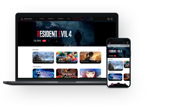
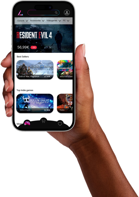
Game Online is an online shop of videogames, consoles and accessories for young adult users. The aim is to help everyone find their favourite videogames quickly and easily to match their particular needs and buy them at the best price.
The Challenge
The project I was tasked to work on required building a cohesive brand and the product design of an online store, as well as ensuring that the user meets their needs. As an essential aspect of the majority of people shopping online is already a basic need so the project is developed to make the app easy and intuitive to use.
My role
UX/UI Design
Platform
Mobile, Tablet, Desktop


Design Process


Thinking of the ideation of the project
-
User flow
-
Low fidelity wireframes
-
Mid fidelity wireframes
-
User testing
-
Feedback
-
Preference Test
-
Final UI design
Brand Style
The project I was tasked to work on required building a cohesive brand and the product design of an online store, as well as ensuring that the user meets their needs. As an essential aspect of the majority of people shopping online is already a basic need so the project is developed to make the app easy and intuitive to use.
Logo
Colours
The project I was tasked to work on required building a cohesive brand and the product design of an online store, as well as ensuring that the user meets their needs. As an essential aspect of the majority of people shopping online is already a basic need so the project is developed to make the app easy and intuitive to use.


Typography
The principal typography for my headers is Nunito, with different sizes on headers for the website, and the main typo for my body text will be used Inter.


User Flow

Wireframes

%201.png)

Low fidelity wireframes

Mid fidelity wireframes


%201.png)

User Testing
The principal typography for my headers is Nunito, with different sizes on headers for the website, and the main typo for my body text will be Inter.

Witness the intuitive navigation of the app by giving the testers some tasks to complete and see if they feel comfortable using the app.

-
The user flow was intuitive?
-
Can users easily buy an item?
-
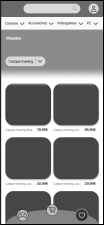
Can users add an item to the Wishlist categories?

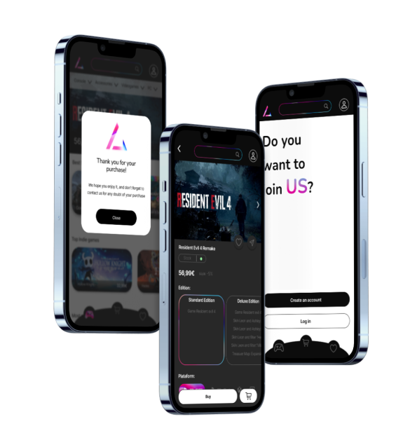
I changed some aspects of my screens and added some steps in the user flow.

I added the promo code on the shopping cart instead of keeping it on the payment method screen. Here, the user will see clearly the change in the price besides the item on the shopping bag, instead of going directly to the payment method.

I realised that my prototype lacked some screens, so I created them immediately as well as tweaking the user flow.
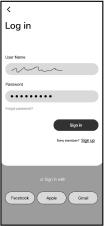
After that, I added an initial screen so the user can Log in or create an account immediately
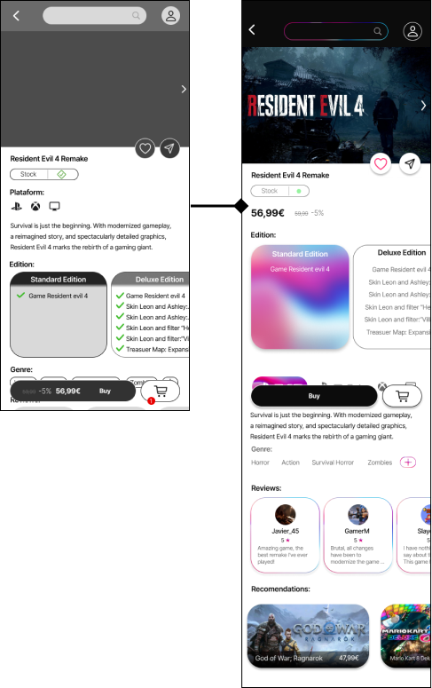
I’ve redesigned the button “Buy” to make the function clearer to the user. I also redesigned some buttons for the login and creation of an account from a screen and eliminated some navigation bars on some screens.

User Preference Test
The results of my user preference test were statistically significant, with a difference of 95%. This test made me confident in choosing the best option for the participants, as it is better.


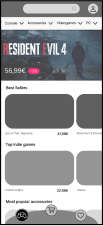
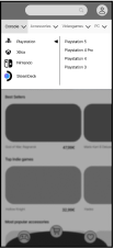
Final UI Design

Final Mockups